Dunwell Autobody
Background
Dunwell Autobody is a car bodywork and paint shop that was going through re-branding. The client’s main goal was to change their target audience, brand image and web presence to represent the company’s new direction.
Tools


Objectives
- Establish a new brand image
- Re-design online presence
- Develop a modern, user-friendly, SEO optimised, high-performing website
- Increase trust and conversions
Duration
12 weeks


Discovery

Interview
On the initial interview to discover the client’s goals, motivation, roadmap, business risks and opportunities.
We have learnt that the client had purchased the business a couple of months before and as part of a complete re-branding they needed help with solving the following problems.
- Mismatch between brand image and new target customers
- Outdated, low performing current website
- Inefficient user journey
- Poor SEO
Opportunity
High-end car owners in the North of the UK had been shipping their cars as far as London for bodywork repair to ensure they are in the hands of a business they can trust. An opportunity has been recognised in solving this pain-point.
Goal
Dunwell Autobody’s goal is to become the go to option for high-end car owners needing body repair in the region. For this they required an online presence designed to showcase their services via a professional, modern, aesthetic website that provokes trust and provides a clear call to action to the target customers.
Ideation & Information Architecture
Competitor analysis
A quick review of similar businesses has given us an understanding of the common content and site structure used in the industry.
The layout of most competitors' websites were found are quite simple and often outdated. Reviewing these has been helpful to in setting up the information architecture.

Wireframes
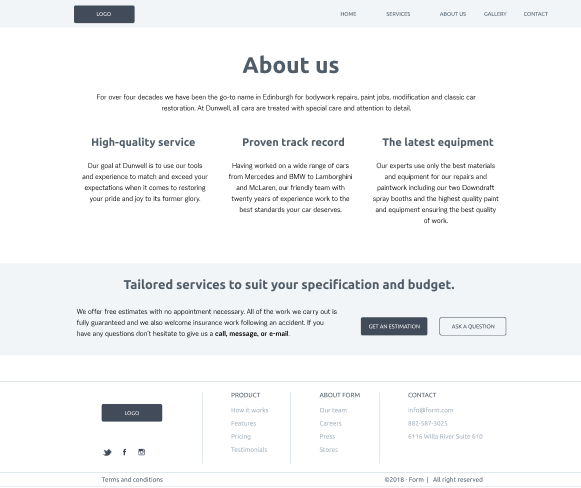
We've made a quick mock-up based on competitors’ websites and the client’s requirements. The goal of this was to visualise the layout and get feedback on it from the client.
Screen-flow
To represent the paths users might take to convert we’ve created a screen-flow diagram.
- Understand user’s needs and goals, pain points
- Create a more user-friendly design
- Identify opportunities and challenges
- Communicate design ideas to the client

Personas
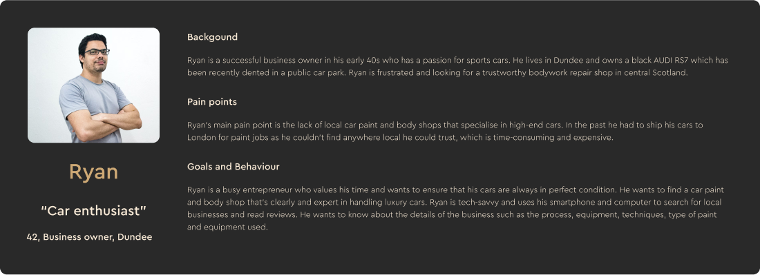
The goals, behaviour, motivation and pain points of the target customers were captured using user-personas. These were created based on customer data provided by the client and we used them to ensure that product is user-centred and provides a smooth, tailored experience.
User journey map
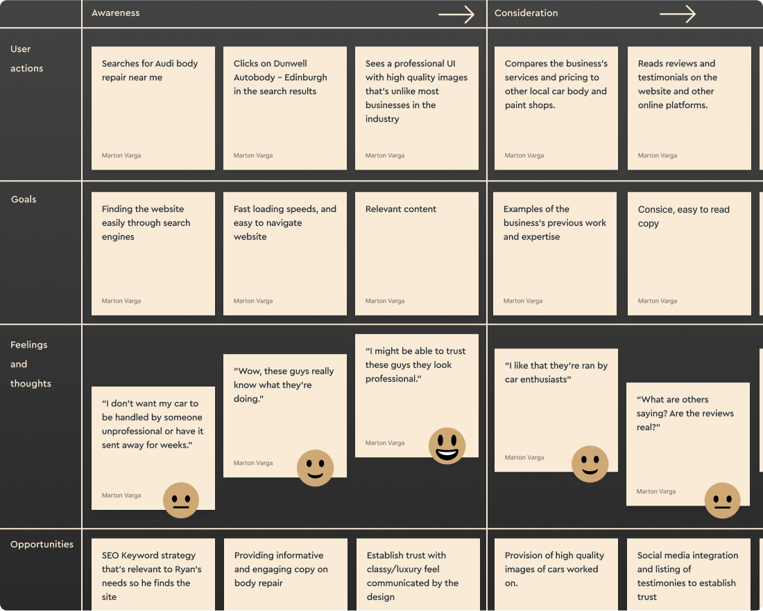
To visualise the experience of users while they interact with the product, We’ve made a user journey map which has helped us to identify pain points and opportunities that have informed design decisions.
Site Map
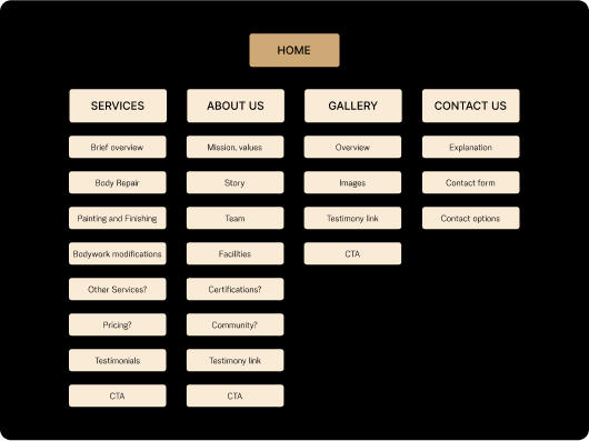
We proposed a site map as a visual representation of the planned site structure informed by:
- The old business site
- Competitor analysis
- Client’s requirements
- User needs
Content Plan
The client’s intention was to use the content from the old business’ website.
However it has become clear that to achieve the the client’s goal of maximising SEO and user experience, new copy would need to be written with more attention to key words and the target users’ needs.
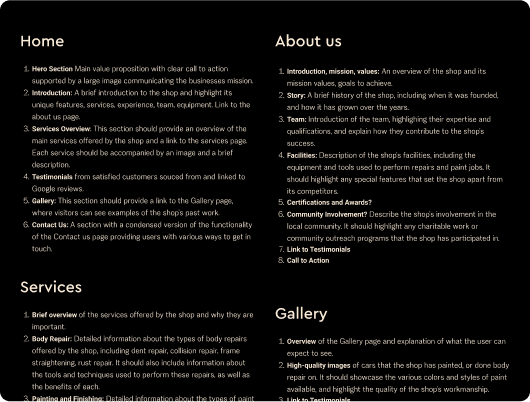
We've created a content plan for the client laying out the recommended structure, based on the user journey map. This has served as a framework for copywriting.
Visual Design
Colour palette
Choosing a dark background can be a risky move but, in the case of luxury brands it can be a good way to communicate brand values and stand out. Gold and champagne have been selected to convey a sense of elegance and excusivity.
Luxury brands tend to use tones of gold or red along with black however, we have limited the use of claret to a small accent in the logo because various tones of gold, champagne and black were sufficient to create a clean, minimalistic colour palette.

Hierarchy & typography
To support the exclusive feel of the brand while also communicating stability and tradition, a simple, elegant sans-serif typeface has been chosen. Eirene Sans is the only font we used throughout the project keeping the platform cohesive and professional while communicating hierarchy and emphasizing importance.


Logo
We were provided with a logo to use that we though was great except for a slight issue. The original red colour on the logo did not provide enough contrast on the black background for sufficient legibility. We've made some quick changes to fix the accessibility issue and also make the logo consistent with the colour palette.

User Interface Elements
High-end cars often feature curved and reflective body panels which We wanted to compement by using rounded shapes and glass-effect surfaces in the design.
The goal was to find a balance between consistently conveying the brand identity, making user experience engaging and keeping site performance in mind for development later.

Prototyping
We've made 4 iterations of prototypes, constantly improving and collaborating with the client. Starting with an initial mock-up leading to a high-fidelity clickable prototype that imitated the intended navigation and showcased a pixel perfect user interface design.
User testing
The high fidelity version of the prototype was used to carry out a task based usability test with the help of MS Forms. Participants were recruited from the target customer group of car enthusiasts to gain feedback on the design focusing on:
- Navigation
- Visual design
- Accessibility and efficiency
- Clarity of content
- Users’ previous experiences


Results
Positives
Feedback from users was generally very positive and users have confirmed:
- “Elegant, professional, smart, clear and straigt-forward design”
- “Appropriate colour scheme”
- “Clear headings and navigation”
- “Solid impression of a team with long standing reputation”
- “Business feels approachable and attractive”
- “Modern and easy to use unlike most websites in the industry”
Issues
Participants have provided some valuable feedback on possible issues that we considered important to follow up on.
- “Navigation links text size too small for certain groups”
- “Use "Get a quote" as a main heading?”
- “More holistic phrasing for what you do”
- “Unclear pricing”
- “Larger logo in nav bar”
Development & testing
Webflow
Advantage over competitors
We used webflow to bring the custom design to life and maximise the client’s competitive advantage with:
- Smooth interactions and engaging user experience
- Custom load and scroll animations
- Infinite scalability
- Security and reliability
More features
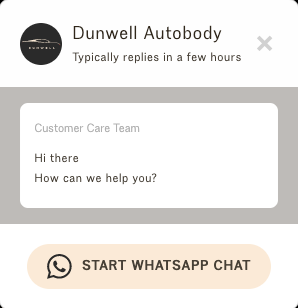
- WhatsApp chat widget
- Google Analytics integration
- Verification and submission to Google for better search ranking
- Superior performance and SEO tools
Performance improvement
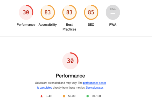
Site performance is crucial to maximise the likelihood of visitors converting into customers. We’ve audited the new site using Google Lighthouse where a significant 68% improvement was confirmed compared to the old site.

Conclusion

The project objectives and the client’s expectations have been met and confirmed by user testing and the performance audit.
- Established a re-designed brand image, tested with users.
- Developed a modern, unique, high-performing and user friendly website.
Enjoyed the collaborative process with the client and looking forward to working with them in the future.

From The Client
"Working with the team could not have been better. The time and effort that went into each detail was incredible. Marton helped with a lot of SEO optimisation which is key for all websites and growing any company. They went above and beyond the brief and I could not be happier with the results."
Luke J.
Dunwell Autobody - Owner
Get in touch
Ready to take your online presence to the next level?
We'd be happy to hear about your idea and put together a free proposal. Just fill in the form below or send us your brief to contact@peakflow.site Let's bring your vision to life!
Whether you have questions about our services, want to discuss a potential project, or just want to chat about web design, we'd love to hear from you.
Rest assured, we will only use your information to correspond with you.
